Mobile Menu for Smartphones & Tablets
The Mobile Menu for Smartphones & Tablets is an easy to use slideout menu that can be closed by tapping anywhere outside of the menu.
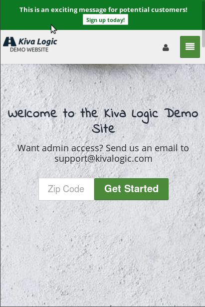
When the menu is opened, a dark overlay will be displayed on the rest of the visible area of the website. If you touch any of the dark area outside the mobile menu, the menu will quickly close, allowing the customer to get back to browsing your website.
The menu will display some default system links like login, signup, and shop, and it will also load any content pages that you have set to be displayed in your main navigation bar.
Being able to 'touch' anywhere outside of the menu to easily close it is useful and necessary for customers that have grown accustomed to the modern day mobile experience.